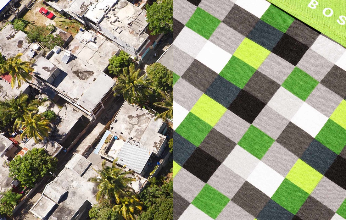
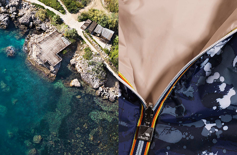
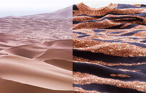
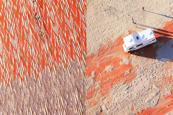
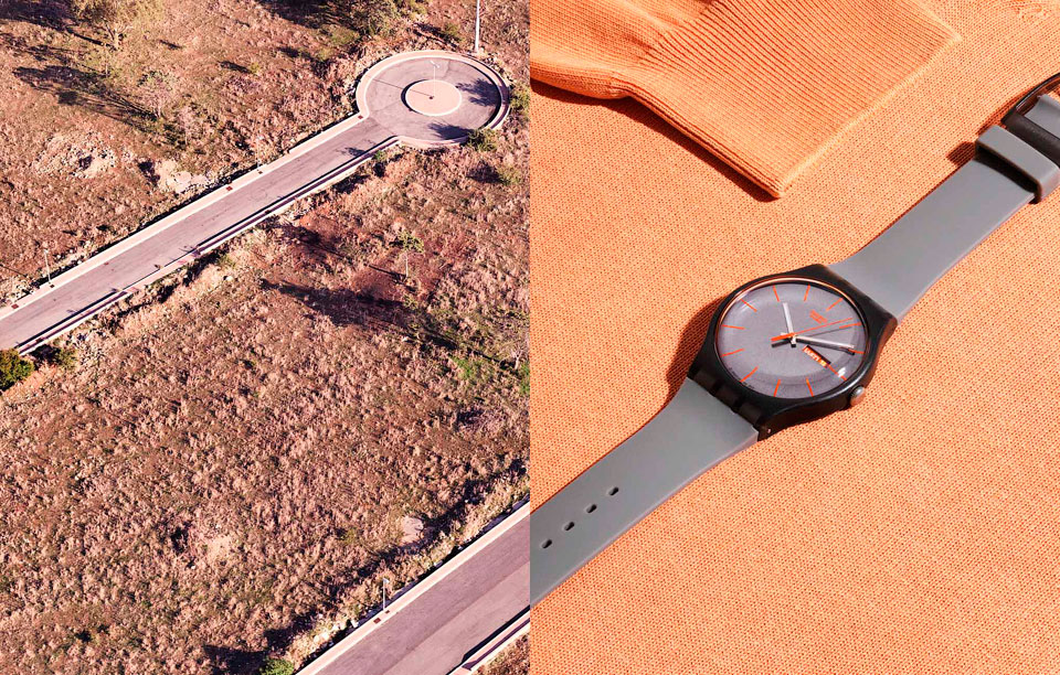
I really like Joseph Ford's photos. I think what makes them so interesting and unique is their ariel view. My favorite is the second one, where on one side there is the ocean and the shore then on the other side is a jacket that is half zipped. I really like this photo because it's something that I would never think to put together. Also, I really like how these photos have such a different perspective but when put together and lined up, it creates one image, despite one being an ariel view. The colors are slightly different, yet, in my opinion, they match perfectly. It makes it more interesting that they are different colors. I think if Joseph Ford was trying to create this photo to show that these two images can go together, then he did a really great job. The zipper line drags your eye to the other picture, which provides unity. Then, the road or dirt path brings your eye to the edge of the photo.
|
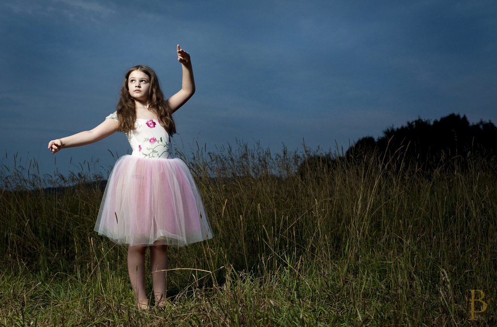
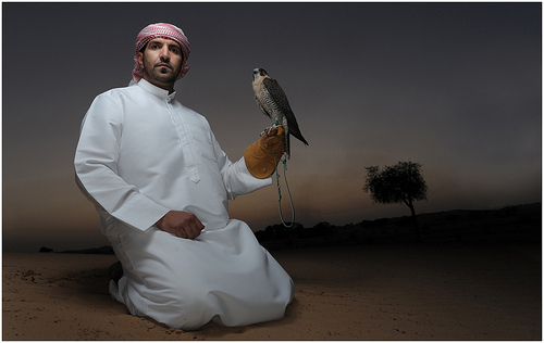
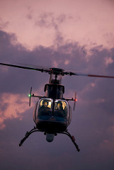
I really like these photos, mostly because they are outside. I also think that his photos really convey dramatic lighting. I don't really like the first photo, but it's obvious that the light is pointing on her and I like how the rest of the photo is really dark. It just clearly shows the idea of "impossible" light. I really like the colors in the middle photo. And the light used really makes the colors bright. But I also like the background; there is little color but I think that the light creates a lot of emphasis on the subject. Again, this photo uses "impossible" light, which I think makes the photo really sharp and he uses the rule of thirds in both the first and the second photo with the placement of the people in the foreground and the nature in the background. The third photo is really awesome, and my favorite. In contrast with the other two photos, this one does not use the rule of thirds. However, I really like how the light is in the helicopter it is very creative and a different way to use impossible light.
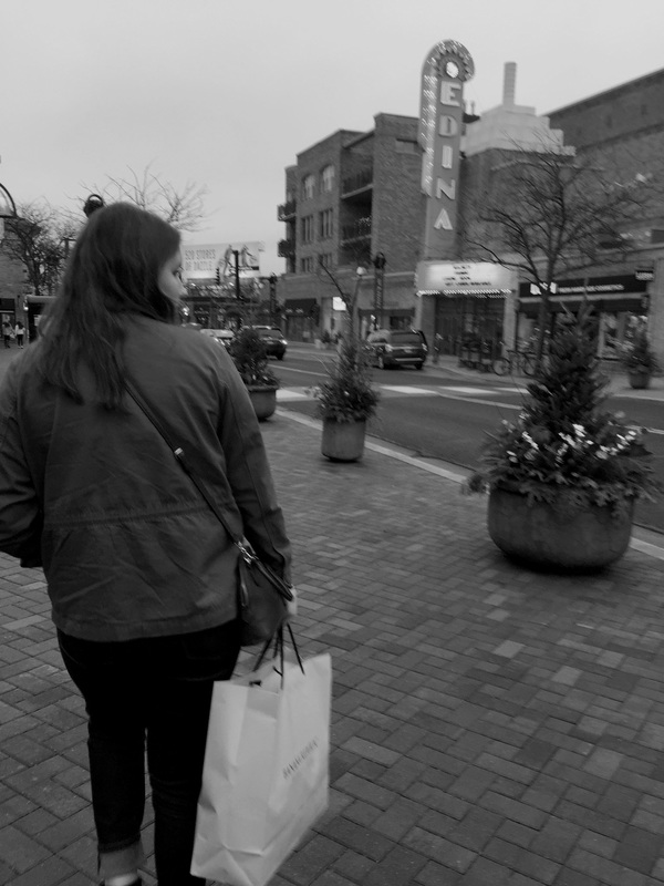
Top Left photo: I like how this photo is in black and white. When I chose this photo to edit, I didn't think it looked good at all and it had little potential, but making it monochrome made this photo look better. Would I retake this photo? Yes, but I would plan it out a little more. If I could change it I would make the EDINA sign focused.
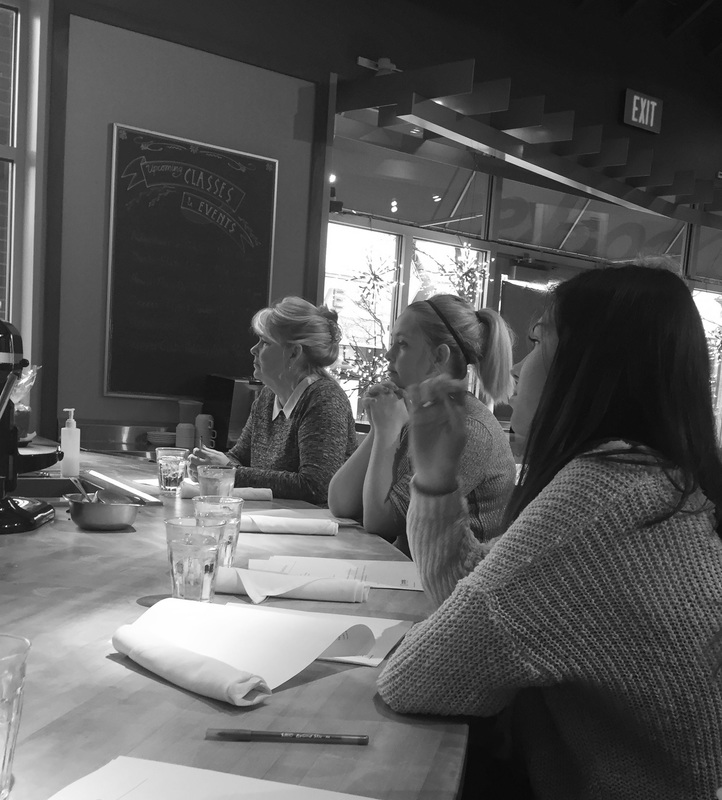
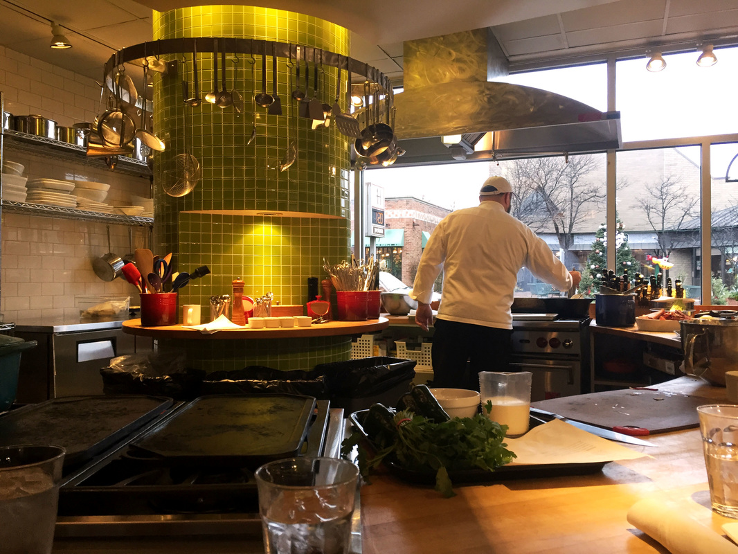
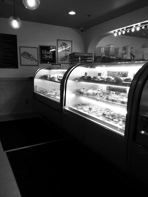
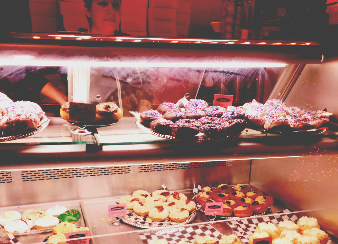
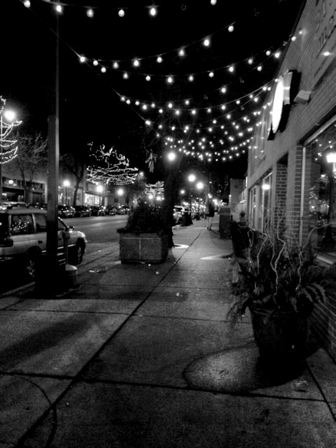
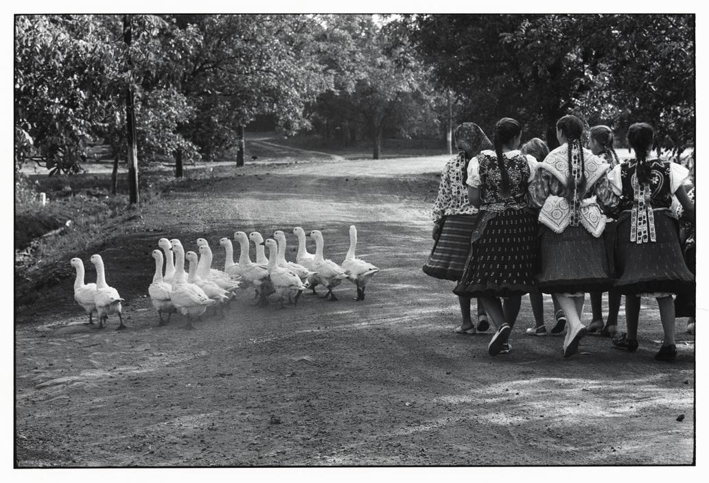
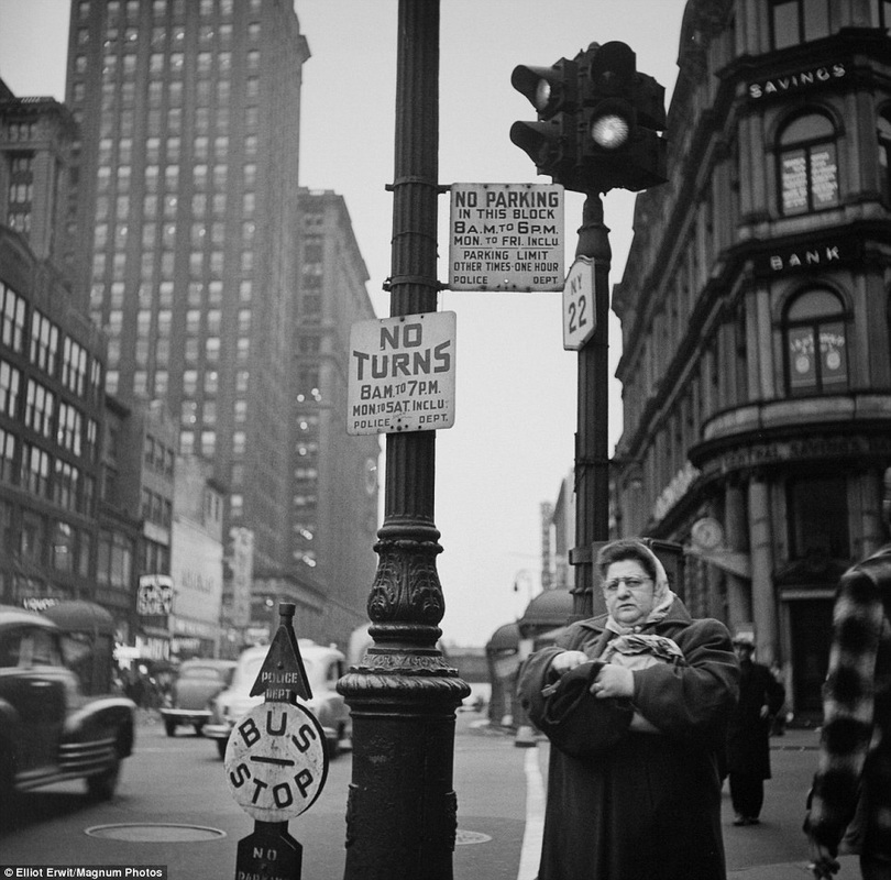
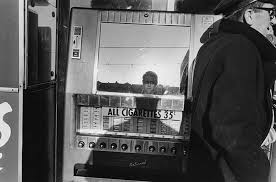
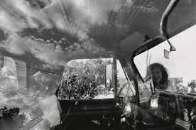
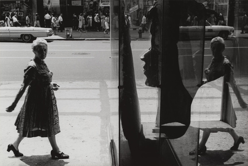
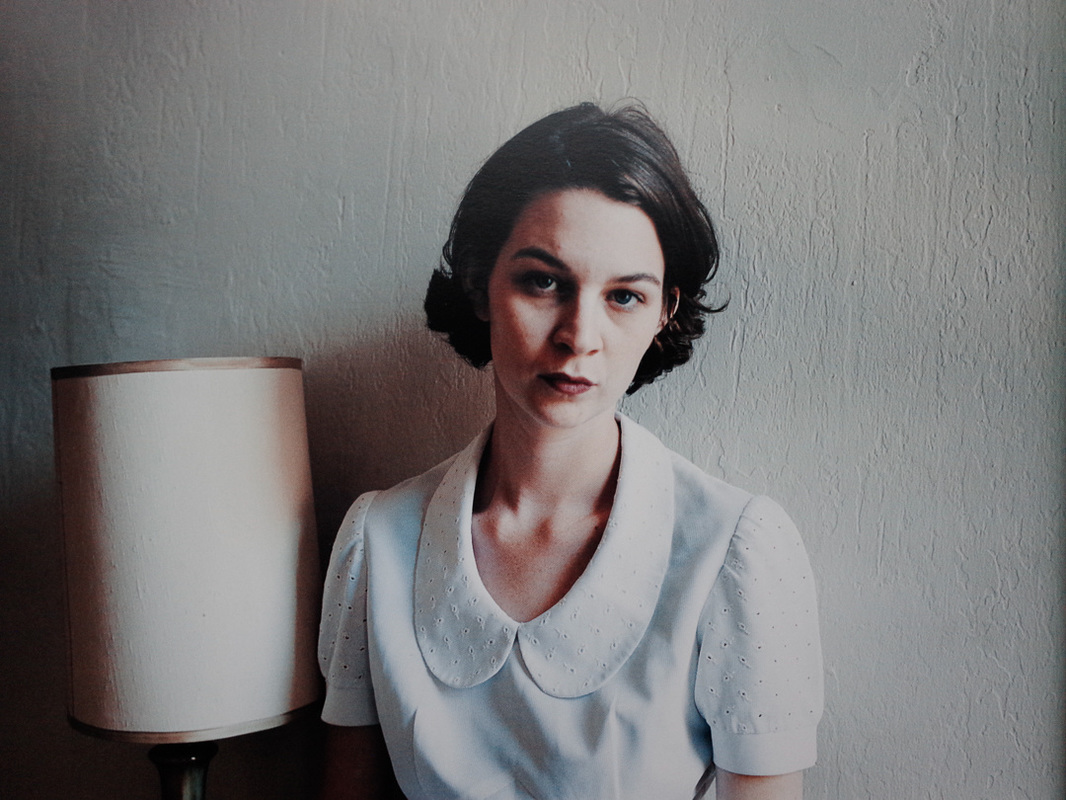
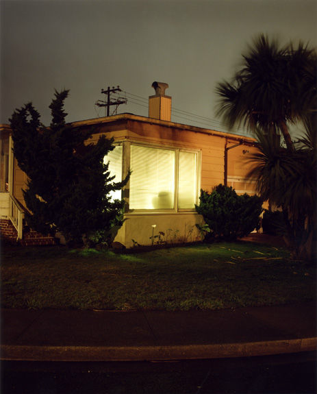
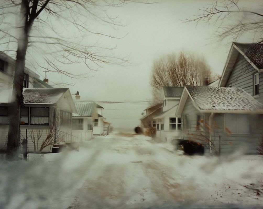
Top Middle Photo: What I like about this photo is how the table curves. The way the subjects are seated gives this photo movement. If I could change anything, I would crop the top of this photo and make the girl's hand in focus. Top Right photo: I like how the chef is not facing the camera and he is actually moving. I also like the the amount of color in this photo. The lights on the green and the red surfaces make this photo look warm versus some of my other photos. If I retook this photo, I would take out some of the props right in front, because I want the chef to be the main focus, and my eye is first drawn to the things placed right in front of the camera. I think this photo is too cluttered. Bottom Left photo: I really like this one because again it is in black and white. However there is a lot of contrast between the light and dark parts of this photo. If I could change this photo I would crop the bottom part a little. I think the bottom is too dark. Bottom Middle photo: I like this photo because I think it looks good in color. I think this photo could've been successful, but I would make the woman behind the counter the main focus. Bottom Right photo: I like this photo because I like how the lines on the sidewalk and the line on the lights lead straight to the center of the photo. I would take this photo with a real camera if I had another chance. I think it could've been much better. Elliott erwittElliott E Elliot Erwitt is a photographer from Paris, France. Most of his photos are in black and white and portray everyday scenarios. In my opinion, I think that making his photos black and white takes away the emotion by use of color to focus more on the subject's actions and facial expressions. The top left photo is balanced between the ducks and the girls. I like it because it is very soft and light. The only contrast in this picture are the girls' dresses and the white ducks which provide the small, right amount of diversity. The middle photo uses the rule of thirds with strategically placed buildings and signs. I like how the woman and the signs are in focus; it brings my attention to them first, before spanning out to the background. She looks irritated; she gives the photo character. The top right photo is my favorite, but I'm biased because I love bread. lee friedlanderLee Friedlander was a photographer from Washington. He was born in 1934 and began photographing things, such as city life, in 1948. One thing I like about his photography is how he captures reflections in his photos. The left photo is my favorite because of the mirror. I like how the focal point is his reflection, then my eyes move to the man towards the edge of the frame. The middle photo contains movement in the clouds; they spread out over the roof of the car. The windshield of the car frames the photo. I like how there is a face in the picture, but she is not the center of focus. The right photo again uses a reflection. The rule of thirds can be applied to this photo. The woman is placed towards the edge of the frame. I like how her reflection is cut off; only half her body can be seen. I also like how her arms and legs are behind her, indicating that she is going forward/right in the photo, rather than exiting the frame. It is clear that she is the subject of this photo, not the reflection. Todd hidoTodd Hido is newer rather than the other two photographers above. Hido is from Ohio and was born in 1968. In contrast to the Friedlander and Erwitt, Hido uses color. I like the left photo because it is a portrait. I also like the slight shadow that is covering a part of her face. This photo is plain, especially with the white background, but the wall is not smooth which gives this photo texture. Besides, with fewer subjects and other distracting components I can focus on her face. I think that is the whole point of this photo. The middle photo is my favorite. I like this one because it has a 3D feel to it the way the corners of the house are pointing outward on the photo. Also, there is a lot of contrast and balance between the dark trees and the bright window in the middle. There is a soft light cast on the side of the house, which is kind of confusing, but it makes me think about where the photo was taken, like maybe it is a street light. The third photo is my least favorite, because there is much color or contrast. But I like how the photo is sort of symmetrical with the house on either side and the road down the middle, it's like the photo could be split in half. But the tree on the left makes the two sides different.
|
AuthorWrite something about yourself. No need to be fancy, just an overview. Archives
February 2016
Categories |
 RSS Feed
