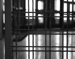
In this photo I used the element LINE. The bars move the person's eye throughout the whole picture. Though the background is blurred, it provides balance between the spaces of the bars. This also provides and shows emphasis.
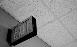
In this photo I used SHAPE. The exit sign shows shape by moving the person's eye throughout the whole picture. The lines on the ceiling balance the photo. Which, makes for a contrasting background. Another principle I used was the rule of thirds. The exit sign shows three-dimensional shape.
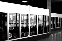
In this photo I used FORM. Form is showed by the three-dimensional shape of the trophy case. The ceiling lights and the pillar in the background show emphasis. Another principle I used was contrast between the light and dark areas in the photo.

In this photo I used TEXTURE. I used emphasis between the light textured areas and the dark textured areas. The other principle I used was balance.
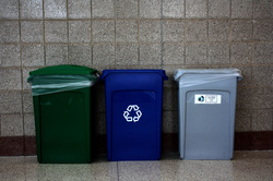
In this photo I used COLOR. I took this photo because these bins have very bright color, except for the gray one. They show emphasis and balance against the brick wall. The lines in the brick show pattern.
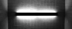
In this photo I used VALUE. The light shows emphasis against the dark background. This brick also shows pattern. The light moves the person's eye throughout the picture.
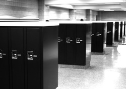
In this photo I used SPACE. Space is shown in between the lockers. And also in between the pillars in the background, which are perpendicular to the tops of the lockers. The lockers show movement and rhythm, or pattern though out the whole photo.


 RSS Feed
